sun/moon process writeup
(originally posted to Patreon on May 20 2021)
hi hi! so sorry for the delay on this one, i got slammed with a lot of stuff right after i finished up these drawings (vaccine shots, illnesses acting up, etc) but here it finally is, haha.
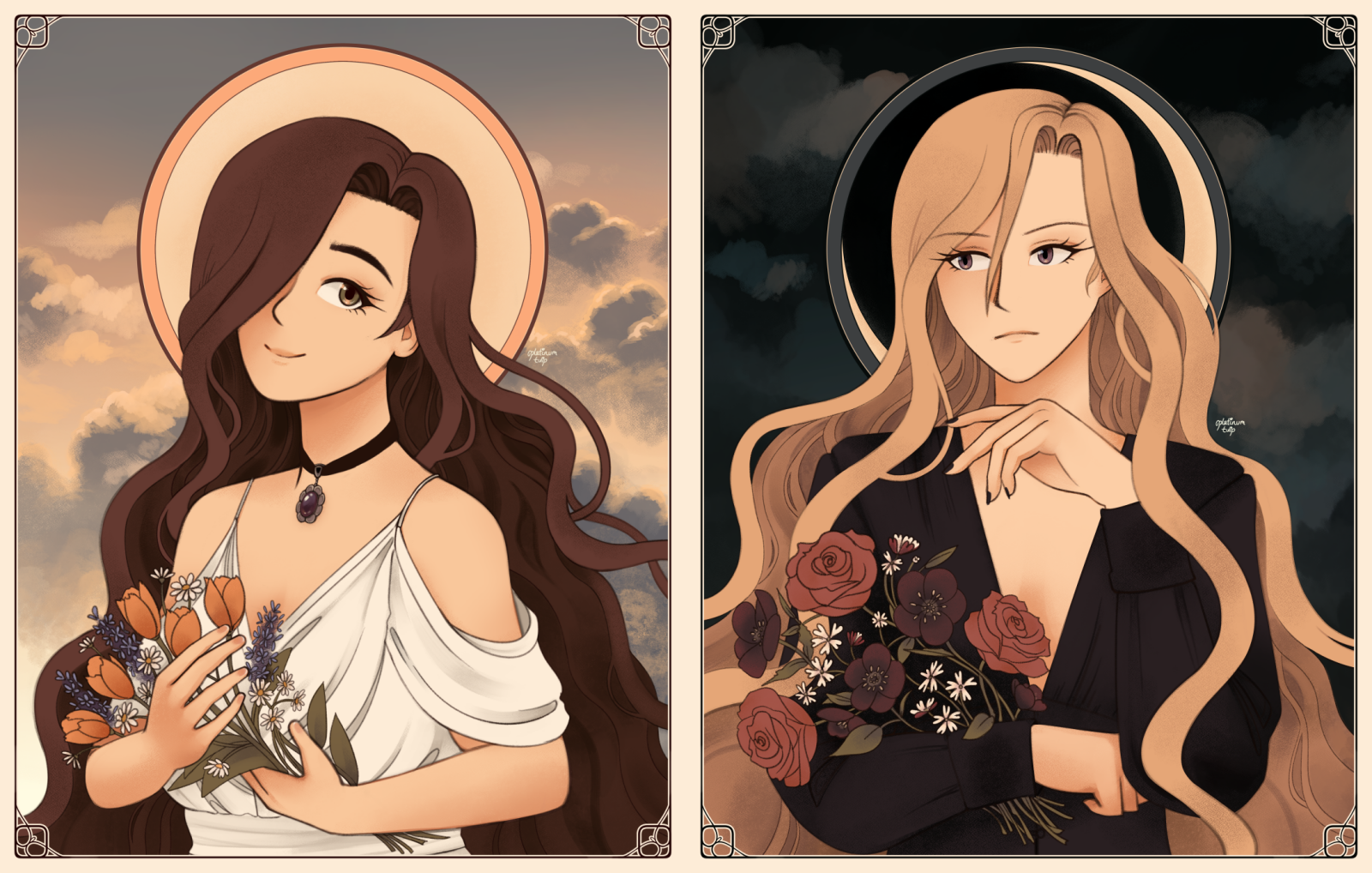
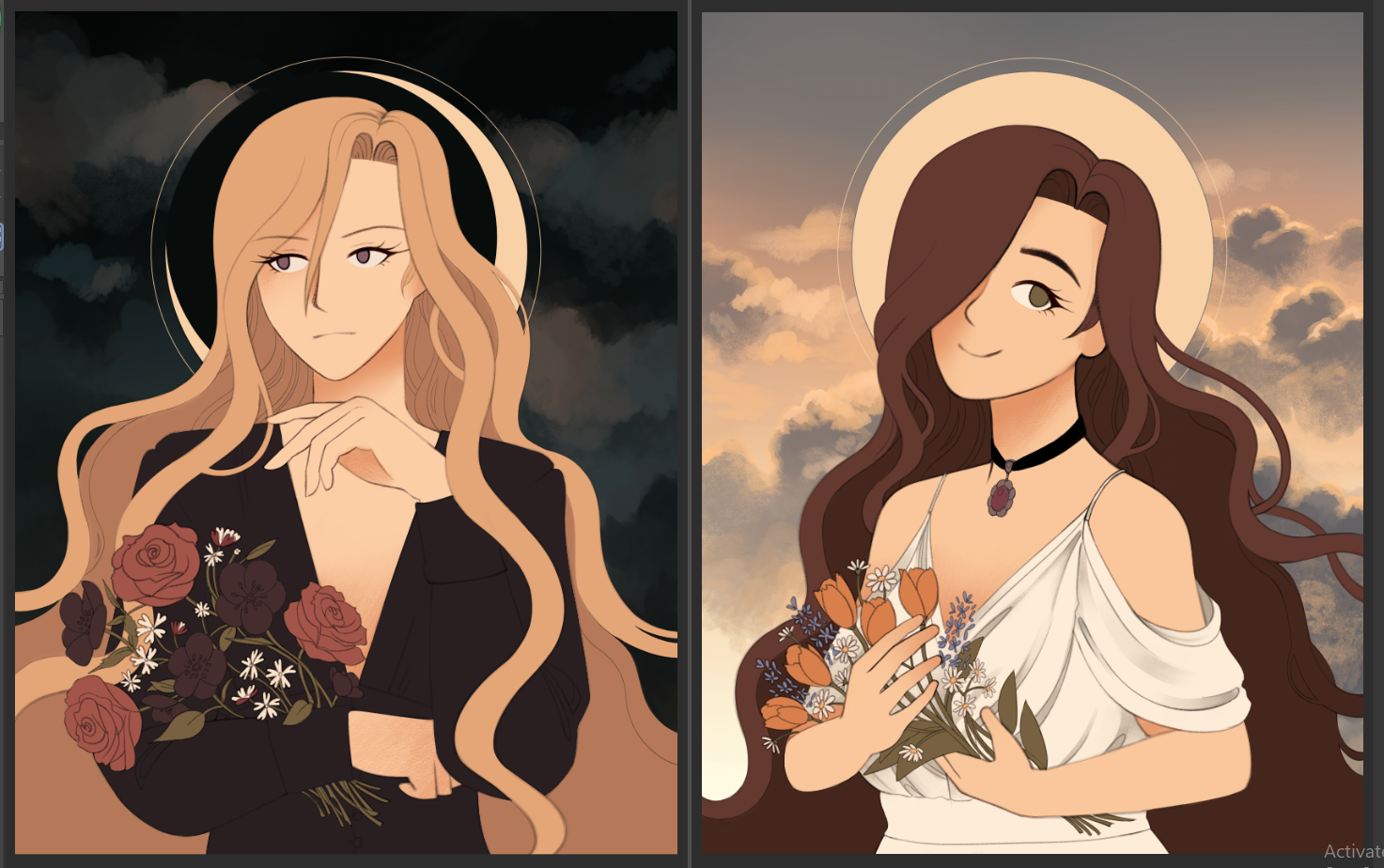
so i've had this kind of idea in my head for a while now - some kind of sun/moon themed illustrations for Rosemary and Diana, maybe art nouveau inspired? - and it's kind of a weird tradition for me to draw something self-indulgent when my birthday rolls around. i'd been kind of intimidated to tackle the idea for a while, though, since one drawing takes a very long time for me, let alone two... but i really wanted to give it a shot.
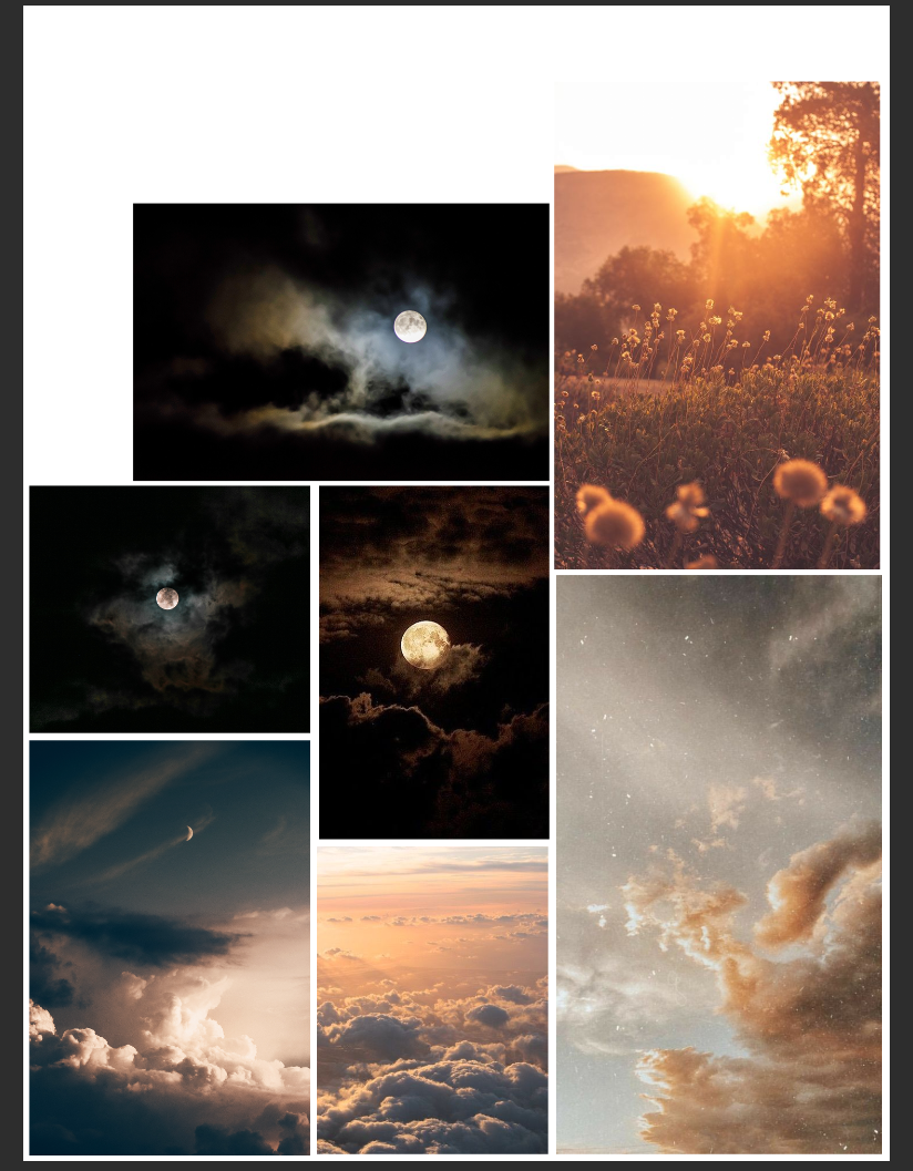
first, it's easiest for me to think in terms of color/mood before i even start drawing, so i sifted through my collection of stock photos for some ideas. (by the way? unsplash/pixabay/pexels are all GREAT resources for free use stock photos)
right off the bat, i knew i wanted to use the same color scheme for both drawings... but trying to think of a color scheme that would work for both a day/night theme was kind of tricky. i wanted enough warm hues to give that kind of radiant sunlight kind of vibe, but it had to be workable for a dark color scheme too. that, and it had to work with Rosemary and Diana's own color schemes, so that was another thing to keep in mind. i got to looking at pictures of sunrises and moonlit skies for some inspiration, and landed on working with navy/gold tones. this allowed me to incorporate more brown or slate blue tones without it looking strange!
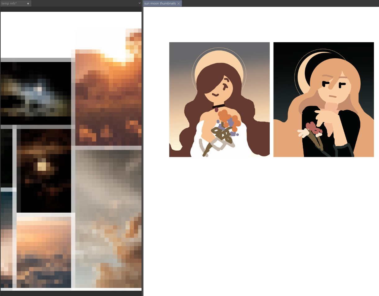
my color tests are always hilariously rough looking though. that's fine. it's just easier for me to scribble it out with a mouse and not worry about the details. that can come later.
ok, time to look for some other details. i heavily referenced Alphonse Mucha's work, since his art nouveau illustrations are so iconic. plus vintage photo portraits from around the same era. i had to figure out what they were going to wear, too - had to fit the vibes i was going for, along with looking interesting in my compositions.
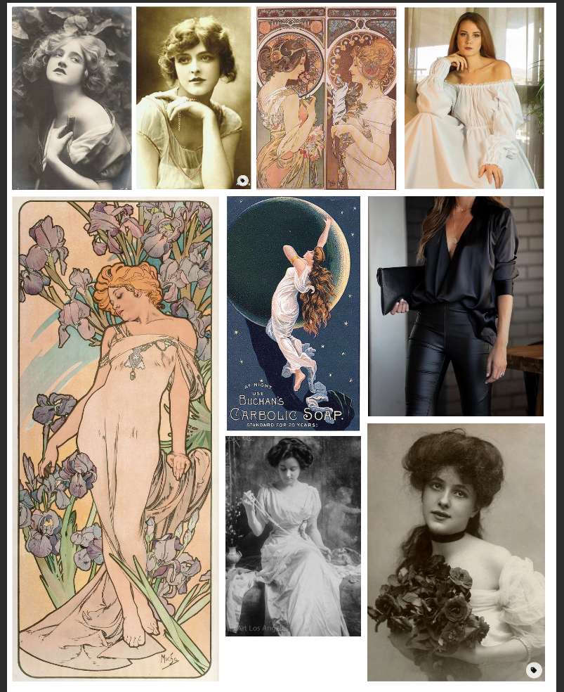
art nouveau usually features flowing fabric, a heavy focus on decorative linework, while having less focus on lighting/shadows on the subjects. this... was actually a little tricky for me, since i'm not very confident with my lines, and usually rely on lighting for definition. but dammit i tried!!!!
also, flowers. i gotta draw flowers.
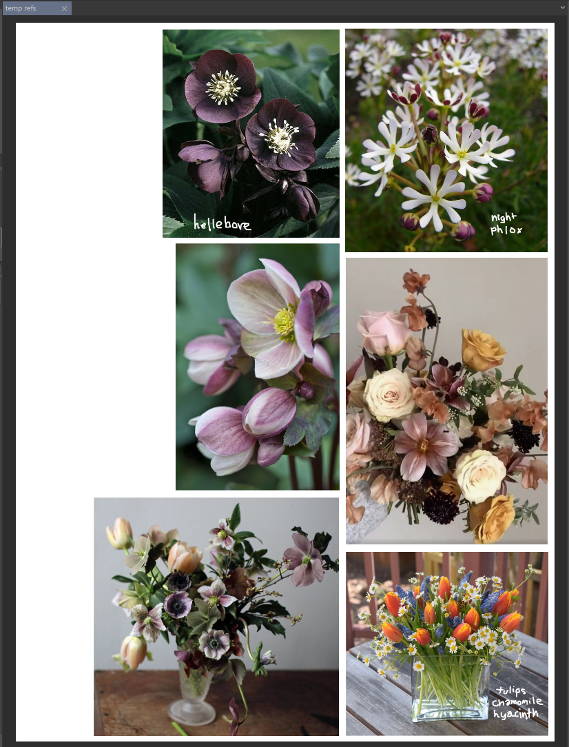
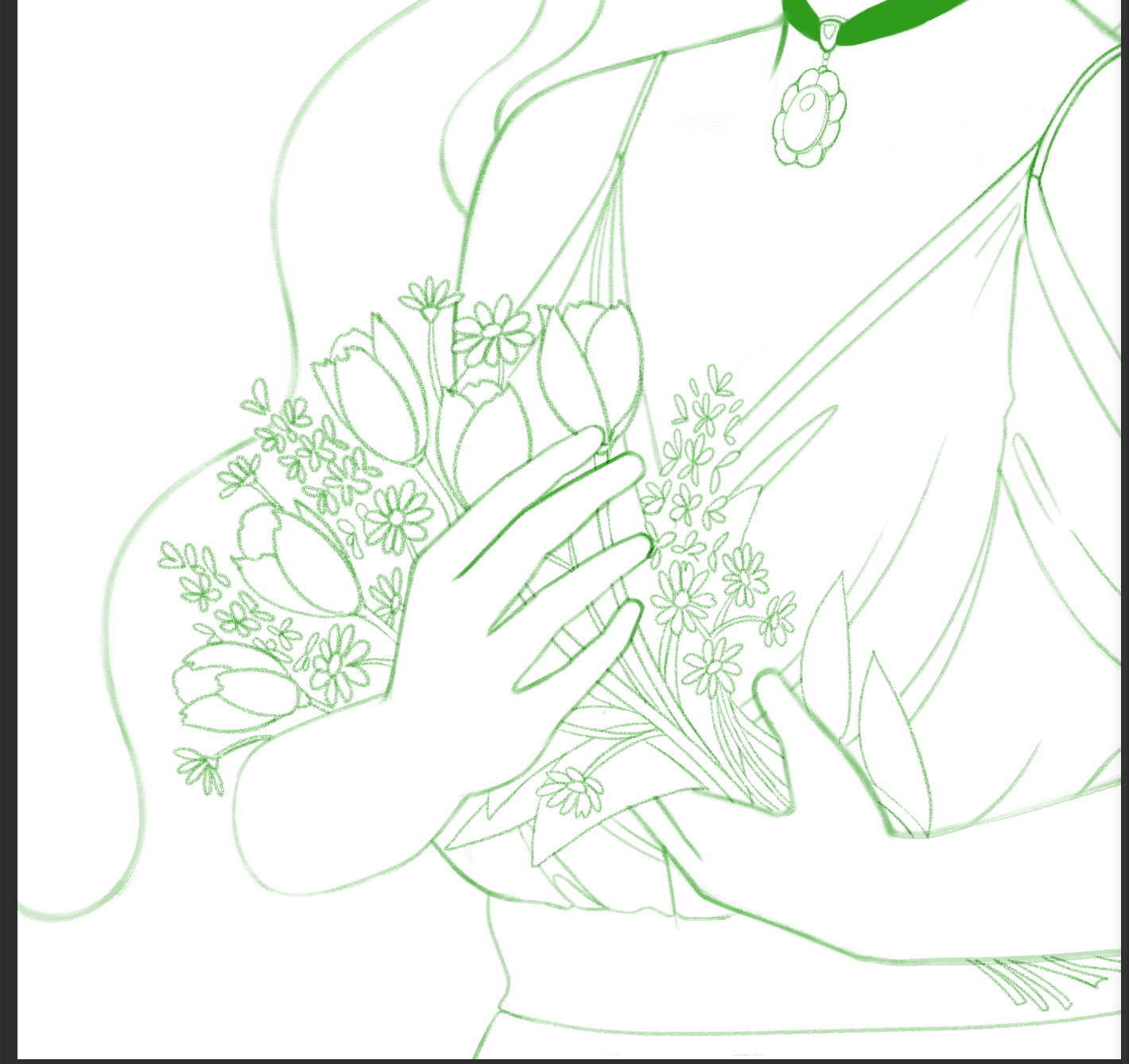
it's been a big goal of mine for years to get better at drawing flowers, so i wanted to really pay attention to the individual flowers. i went with tulips, chamomile, and hyacinth for rosemary's bouquet, and Diana got roses, hellebores, and night phlox. that gave me a good variety of shapes and colors to work with. from what little i know of flower arranging, it's good to have a variety of shapes, sizes, and colors!
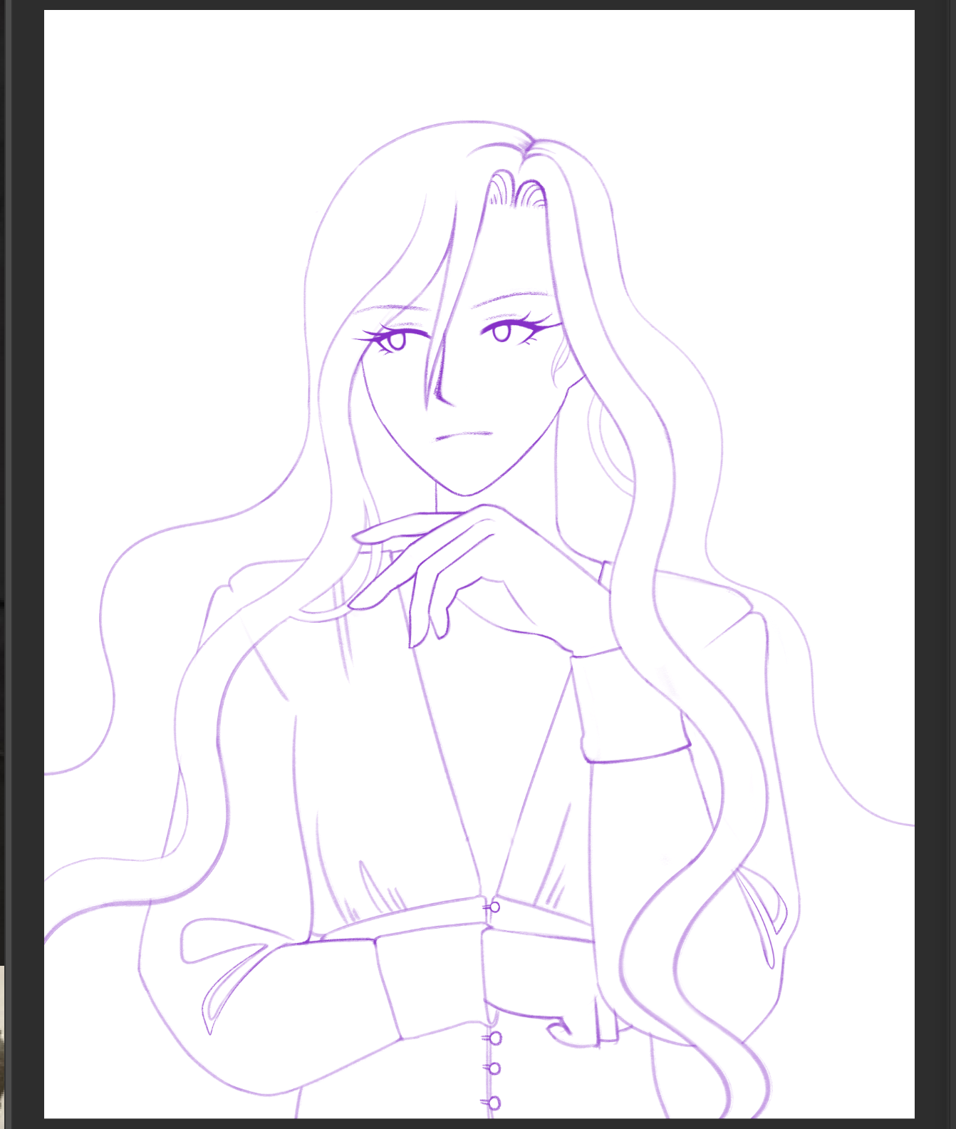
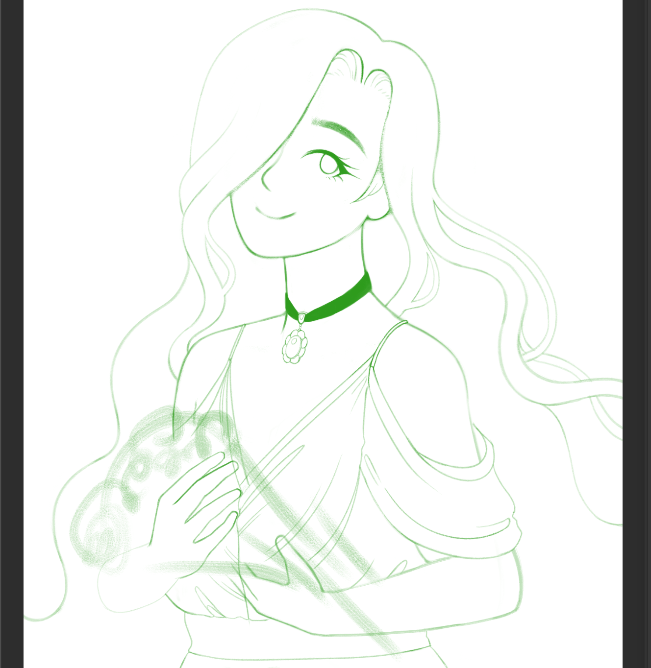
i tried to keep my sketches neat from the get-go, so it'd be super easy to clean them up for lineart. i think i redrew Rosie's dress like, 5 times before i settled on a design i liked. this one was a modern wedding dress, i think, but the gathered fabric and off-shoulder sleeves felt very appropriate to me. ...you can tell i was procrastinating on the flower details though. ahaha...
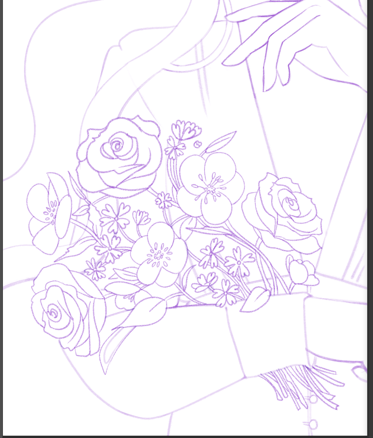
if i remember right, i zoned out for like 4 hours while watching Chess stream. it's like i blacked out and then suddenly flowers were there.
(mostly) flat colors...! see, this is why i start with color thumbnailing. if i got this far and had the color composition make no sense, i would have been DEVASTATED. but i liked how the contrast was turning out! i was really out of practice with painting, though, so i decided to paint some clouds in the background as a warmup. i really like drawing clouds.
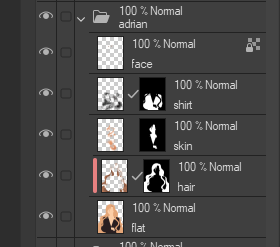
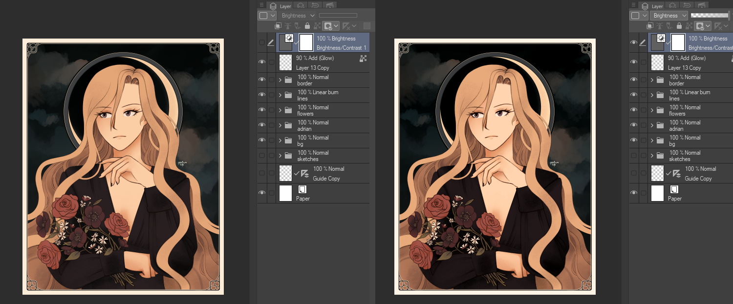
it's kind of hard to explain my painting process, but essentially, i put down flat colors on one layer. then, i stack a few masked layers on top of that for each notable "part". hair, skin, clothing, etc. it's pretty easy to single out each part, cause i can just use the magic wand to select all the hair, make a new layer, make a layer mask out of the selection, and then start working from there. that way, i don't go outside of each section and can paint pretty freely, and it keeps things pretty organized.
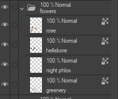
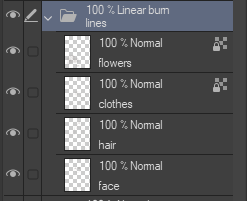
for the flower bouquets, i kept those in their own folder on top of Rosie/Diana's folders, just so it would be easier to keep track of. i just opted to lock the alpha channel instead of bothering with layer masking though. i think this was the right call, i wasn't doing complex painting with them or anything. i wanted the lines to do more of the talking!
also, lately i've been really liking how my lines look if i set the blending mode to "linear burn". it gives the lines a deeper, richer depth that i think looks very nice.
finally, just some last minute brightness/contrast adjustments. usually i do this with a levels adjustment layer because it lets me fine-tune colors more, but... i really liked how the colors came out, i just wanted a teensy bit more contrast. just one brightness/contrast adjustment layer, then, with the blending mode set to "Brightness". this way it wouldn't alter the saturation of the colors, just the value.
and then i was done! whew. i'm still kind of mentally burned out from working on these. i've been trying to do smaller sketches and colored doodles to make sure i stay in shape, but i've been still struggling to work on another big drawing. hopefully i'll have more work done soon! until then, i hope you enjoyed reading this!