moonlight gown process writeup
(originally posted to Patreon on Jul 21 2021)
writing this one promptly this time, haha.
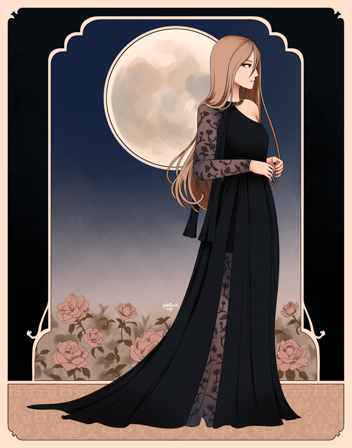
i mostly just wanted to draw Diana in a nice dress, if i'm being honest. so i looked around at some dresses to draw, and i was drawn to this one for a few reasons:
.jpg)
(source: Elie Saab pre-fall 2019 collection)
i thought the one-sleeve design was distinctive looking, and i really liked the lace used on the sleeve and through the dress. the draped fabric over the shoulder and the chunky chain collar were also really interesting looking to me - shame that the belt got covered up by their arms, but i think the dress works without it, too.
i can't find the photo i used for a pose reference, though?? ah well. but i wanted something kind of aloof and elegant feeling, with a focus on emphasizing the length and draping of the dress.
as far as colors go... i actually did not have colors in mind when i first started drawing this. see, it was just supposed to be a sketch, but i ended up really liking how the lines were coming out... it felt like a shame to just leave it monochrome. but my attempts at figuring out color weren't really working, so i thought i'd put it down and come back to it later.
and then of course. midnight rolls around. suddenly realizing what i could do.
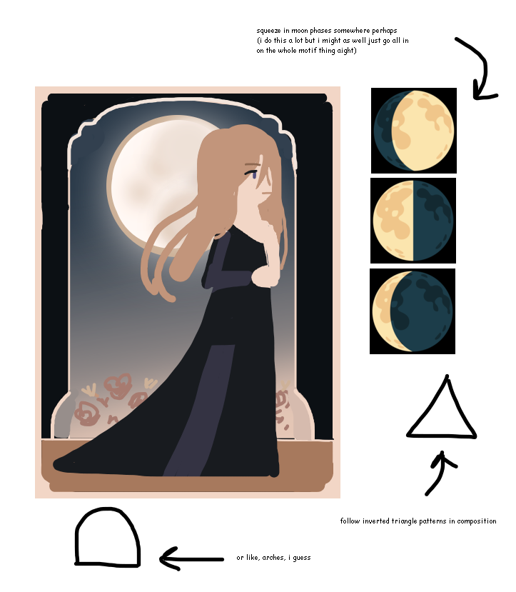
funny thing is, i didn't actually incorporate the moon phase thing in the end. i wasn't really sure where to put them without it feeling obtrusive or sticking out strange, so i decided to axe them. other than that, this was pretty close to what i made in the end.
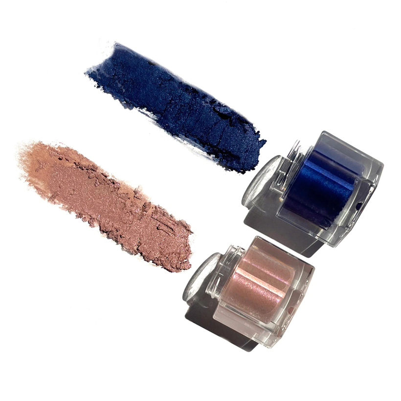
as far as color inspiration goes - this is silly, perhaps, but a makeup brand i'm fond of (Rituel de Fille) came out with a limited-edition set of two eyeshadows, called Garland and Nightfall. they're long out of stock now, since they only made two batches, but the pairing of light rose and deep navy really stuck with me. loved the names, too.
i took more inspiration from Alphonse Mucha illustrations, too, although i think i have a long way to go as far as decorative borders go. haha! i think i could have planned the composition a little better, but i'm happy with how the flowers came out. if i could go back and work on this more, i'd want to add more variation to the flower heights, so it's not just a flat horizon line... but sometimes you just have to accept that something is done. and that's okay! i'm still happy with how this came out.