herald of spring process writeup
(originally posted to Patreon Apr 14 2022)
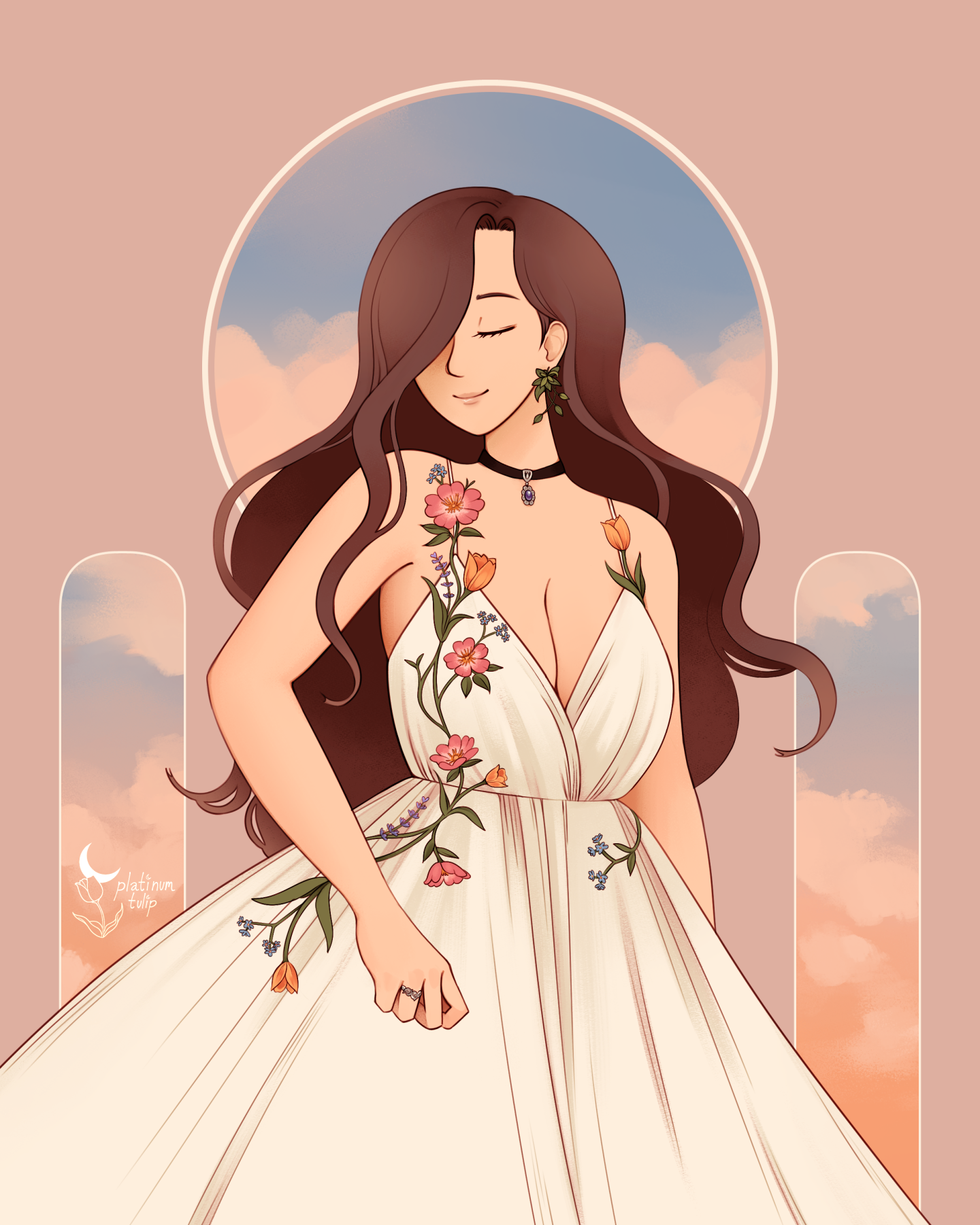
technically, this piece is for Rosemary's canonical birthday (April 25th), but i've decided to post it a little early. i figure if i did a piece for Diana's birthday, it felt appropriate to put one together for Rosie, too. (i'll be sure to do one for Iris in August, too!)
first things first - notes, references, and thumbnail sketches:
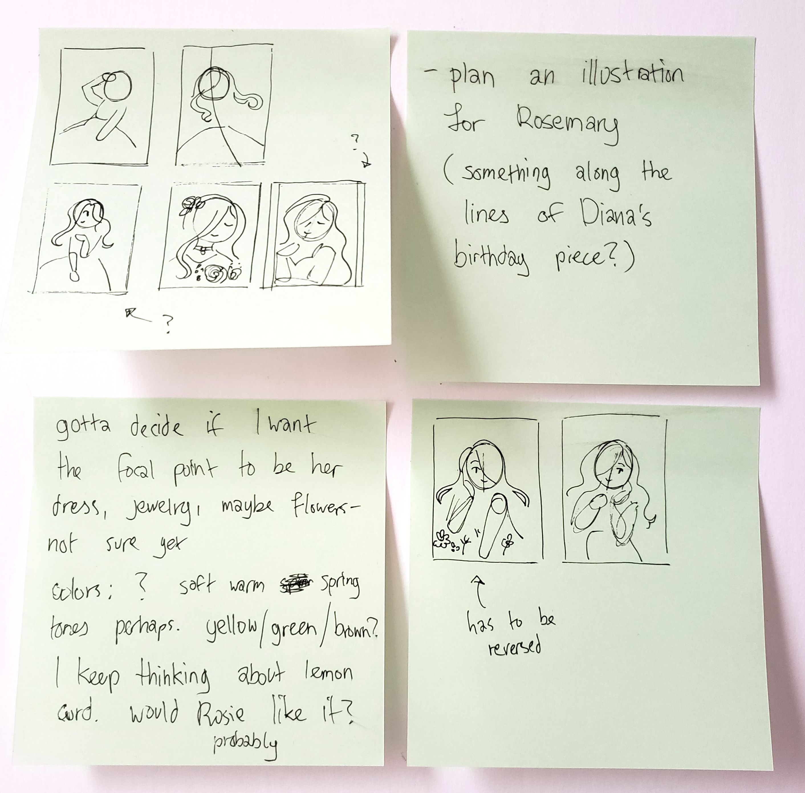
i don't think i used a single one of those thumbnails in the end. ...i also can't explain my tangent about lemon curd, either. listen, i've been really craving it recently, and i just think she would like a lemon-flavored birthday cake...
oh, i did try to do some things with the flower symbolism, at least. i had actually written down some of those flowers already for a scrapped illustration, which saved me a bit of research. forget-me-nots being there is a little bittersweet, though, when you consider the fact that her partner is a vampire...
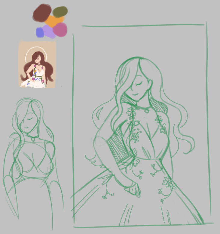
at this point i did actually use this thumbnail. i liked the triangular shape of the composition, and how the shape of her hair kind of echoes the silhouette of her dress. plus the way the flowers on her dress naturally lead your eye on a path through the composition... i felt pretty ok about this concept. (i've been trying harder to pay attention to these sorts of things, instead of half-assing it, lmao.)
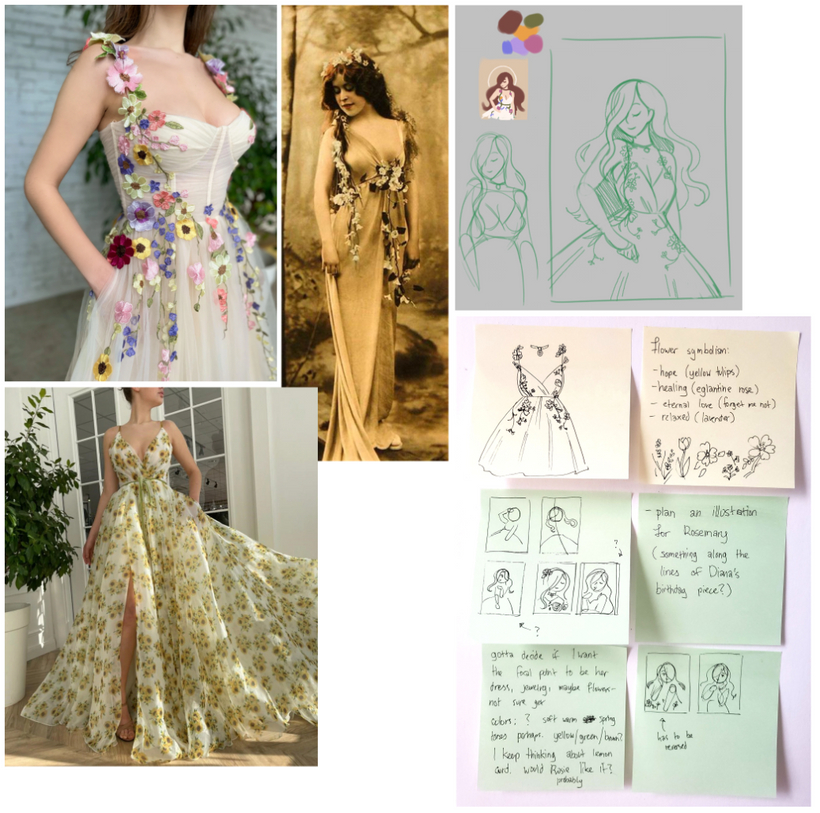
i took a lot of inspiration from Teuta Matoshi gowns again - the Greenhouse Blossom gown (top left) was really speaking to me conceptually, but aspects of the fit itself weren't quite to my taste. mostly the way the cups were fitting and the shape of the neckline. in my mind, i couldn't help but think about the structrual integrity about how it would fit on her body... in addition to feeling that a crossover-style deep V-cut would look better for the overall composition. so i ended up designing a dress heavily inspired by it, instead.
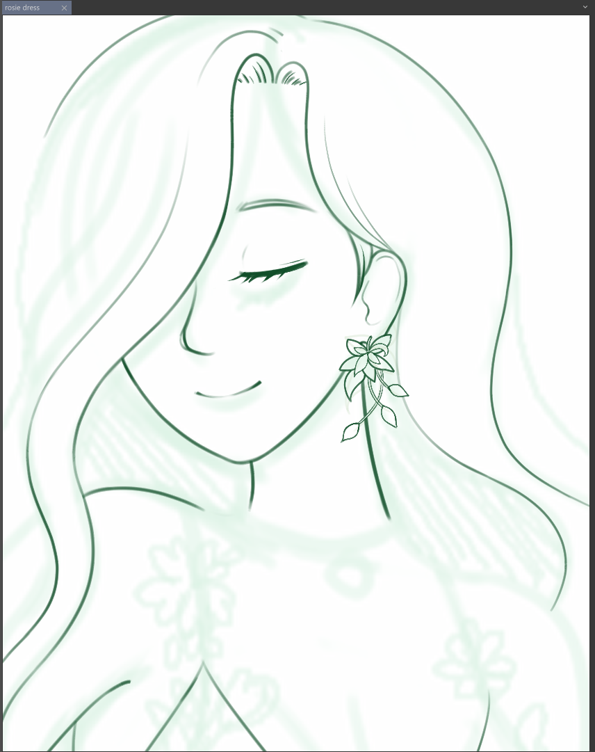
can i just say that i spent hours trying to find a brush i actually enjoyed doing lineart with? man, it's such a delicate balance... i don't like brushes that are too fine/sharp, and honestly, that is most digital inking brushes out there. but i don't want them so soft that you can't do any detail work with them, either. i ended up with a brush that had a softer opacity to it, but still fine enough to do lines with. the tip is kind of flat and narrow, which i liked working with.
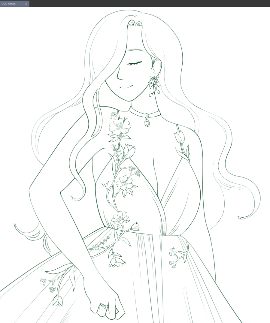
something i really tried to do was let the lines do most of the heavy lifting in this drawing - for a while there, i've been avoiding doing lines because they frustrate and confuse me. but... i really like how lineart-focused art looks when other people do it...!!!! they're just so difficult to work with when i struggle so much with picturing things in my head... trying to figure out where to place lines, deciding on the density of them, how much empty space should there be to let the composition breathe... ARGH, it's so damn hard for me.
but i tried!!! i really really tried. it's something i want to get better at, and while i might not do this for every piece, i'm really glad i put in the effort to try this time.
and then i realized. i got so fixated on trying to work on lines, that i didn't really narrow down what colors i wanted to work with yet. one of my thumbnails had some vague color ideas, and i knew what i wanted to do for the flowers, but the rest of the piece...? i was not really sure, to be honest.
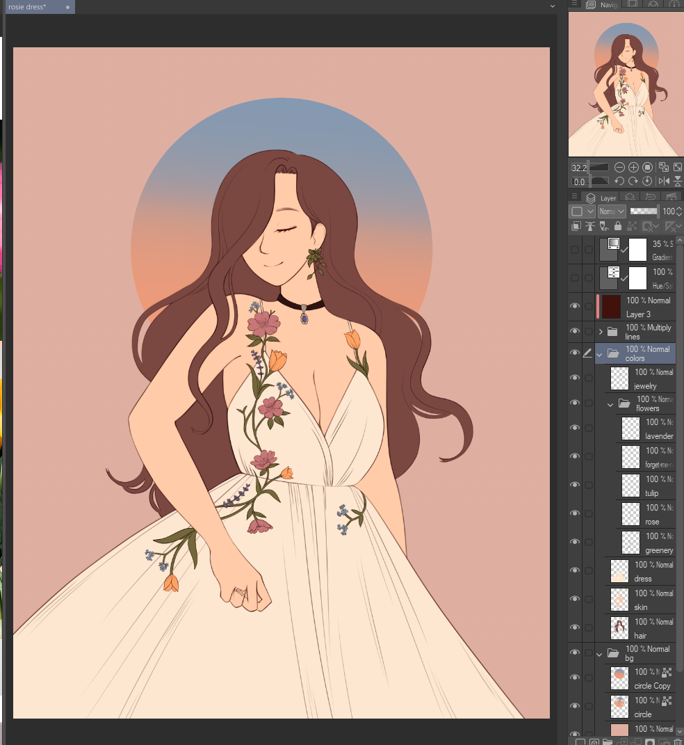
the peach + pale blue was kind of a whim, but i ended up really liking how that looked. it gave the piece a kind of "sunrise" vibe that i was really into. plus it bridged the gap between the cooler flower colors (lavender + forget-me-not) and the warmer ones (tulips + eglantine rose).
my philosophy while painting this was "DON'T OVERDO IT". gentle shadows and soft gradients to suggest depth, but going overboard with lighting or higher contrast could drown out the lines i worked so hard on.
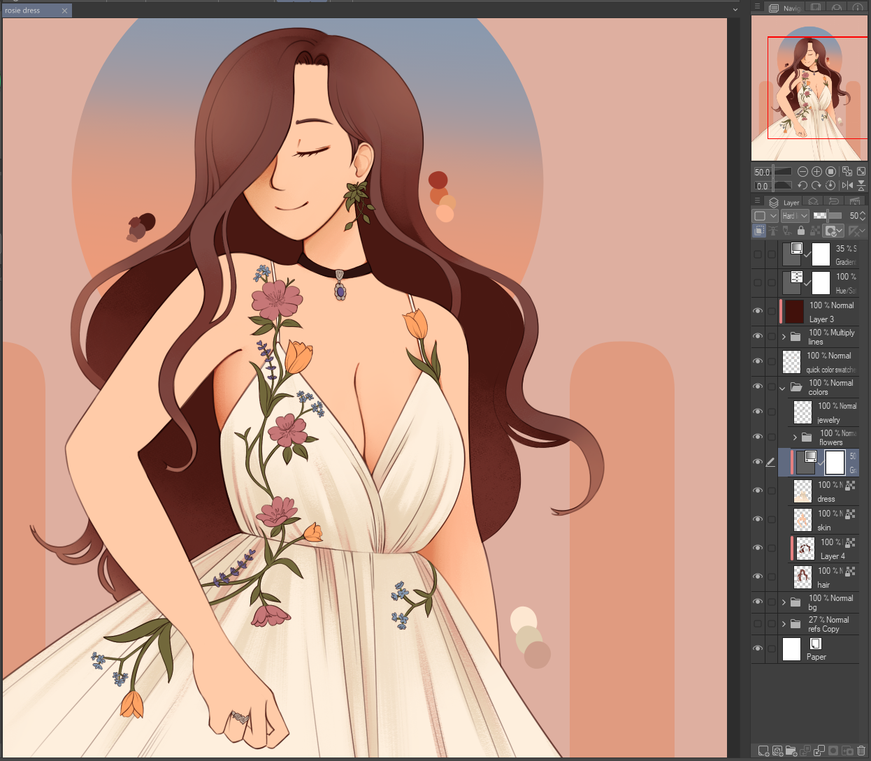
that being said, i was trying to think critically about how i was coloring this, instead of going on autopilot. mixing colors in different mediums has been on my mind a lot lately... i've never been very good with traditional mediums, so i don't have a good grasp on how to mix traditional paints and pigments. but, i was talking with folks on discord about an experimental traditional-style pigment mixing program, which i thought was incredibly fascinating. even if it's not a plugin that's easily accessible at the moment, it reminded me of how differently digital mediums behave.
...that's a very long-winded way of saying "i tried to think more about how i would add warmth and dimension to a shape, instead of simply picking a darker color in the color picker".
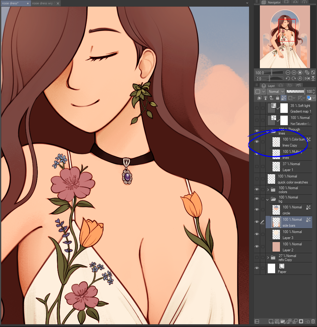
also, my favorite trick - duplicating the lineart layer and setting the layer mode to "Color burn". gives the edges a tinge of warmth and makes the lines look deeper and richer.
after some other adjustments like making the base colors of the flowers more vibrant and painting them, and whipping up a cloud background for the panels behind her, i decided to call it there. part of me really wanted to keep going and add more embellishments to the background, but i was worried it would distract from the finer linework details. plus i've been really ill lately, so i didn't want to give myself more things to worry about...
anyway, here's the finished piece! hope you enjoyed this week's edition of Tulip Thinks Very Hard About Every Last Detail!!!!