cascading ivy process writeup
(originally posted to Patreon on Sept 8 2021)
it's been about exactly a month since my last process writeup post... i kind of took a break from trying to work on big illustrations, both intentionally and unintentionally. i'd been incredibly stressed about what direction i wanted to steer my art in, setting up the server, other things in my life going wrong, and uh, getting really sick for a week and a half.
but hey, i managed to get this piece done, and i'm happy about that!
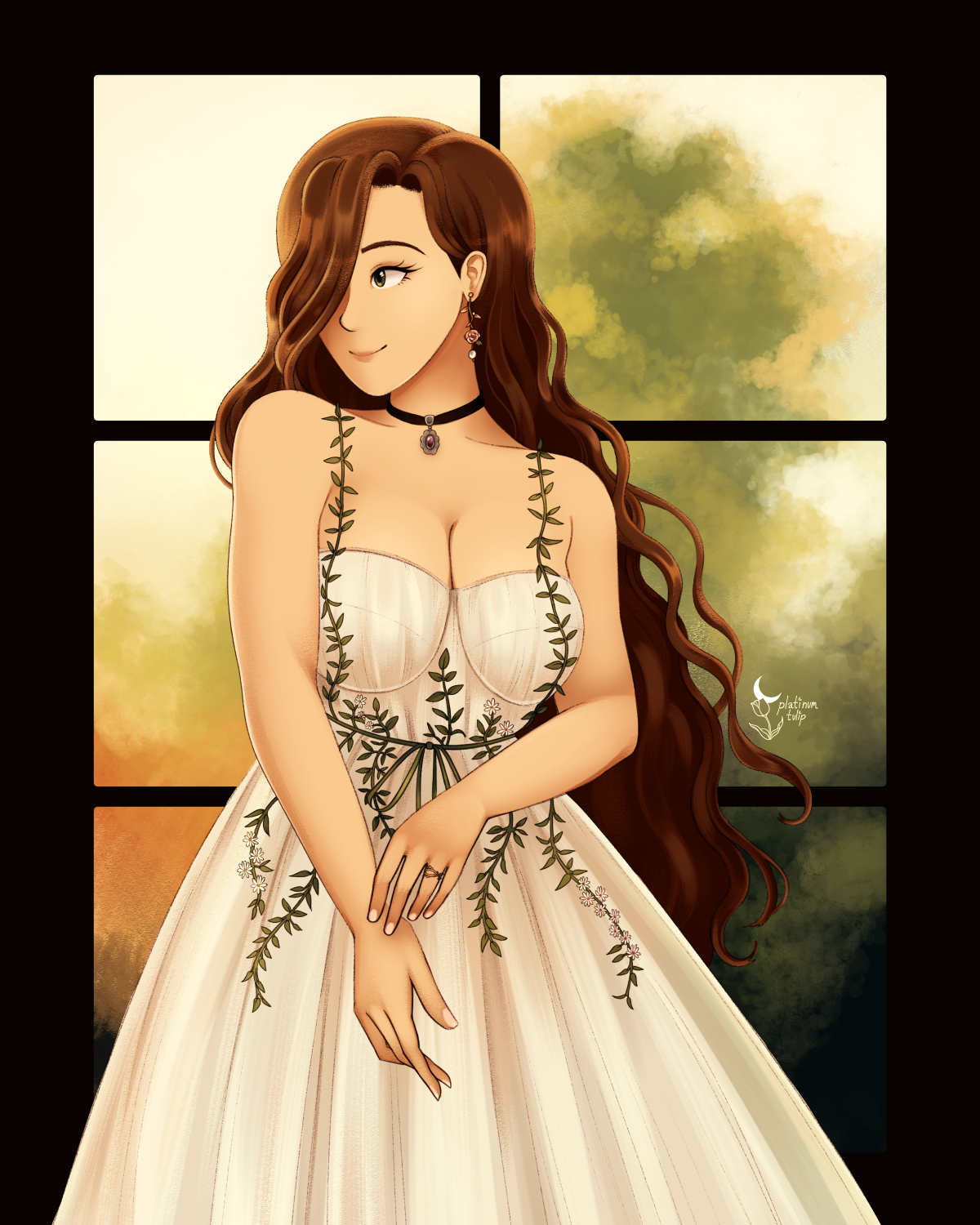
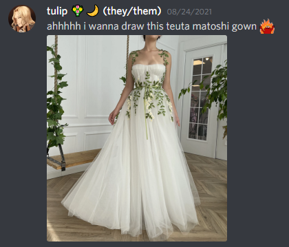
i'd essentially put drawing ideas on the backburner for a while, thinking that some distance would do me some good, and focused on other creative projects. and i think that really helped! anyway, i was just browsing stuff i usually find inspiring, and ended up looking through Teuta Matoshi's dress catalog. the "cascading ivy" ball gown immediately jumped out to me, because i have very predictable taste.
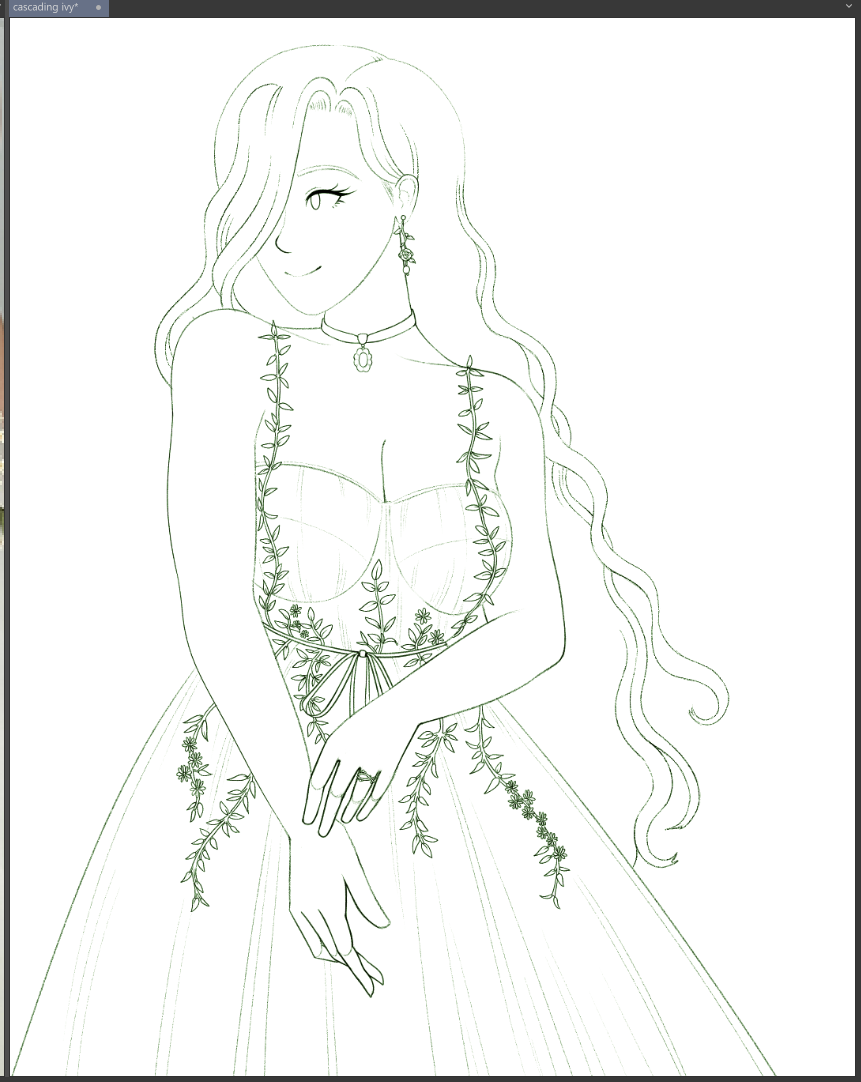
immediately i went to look out for references and try to figure out how i wanted to actually draw this. obviously some kind of composition focused on the dress...
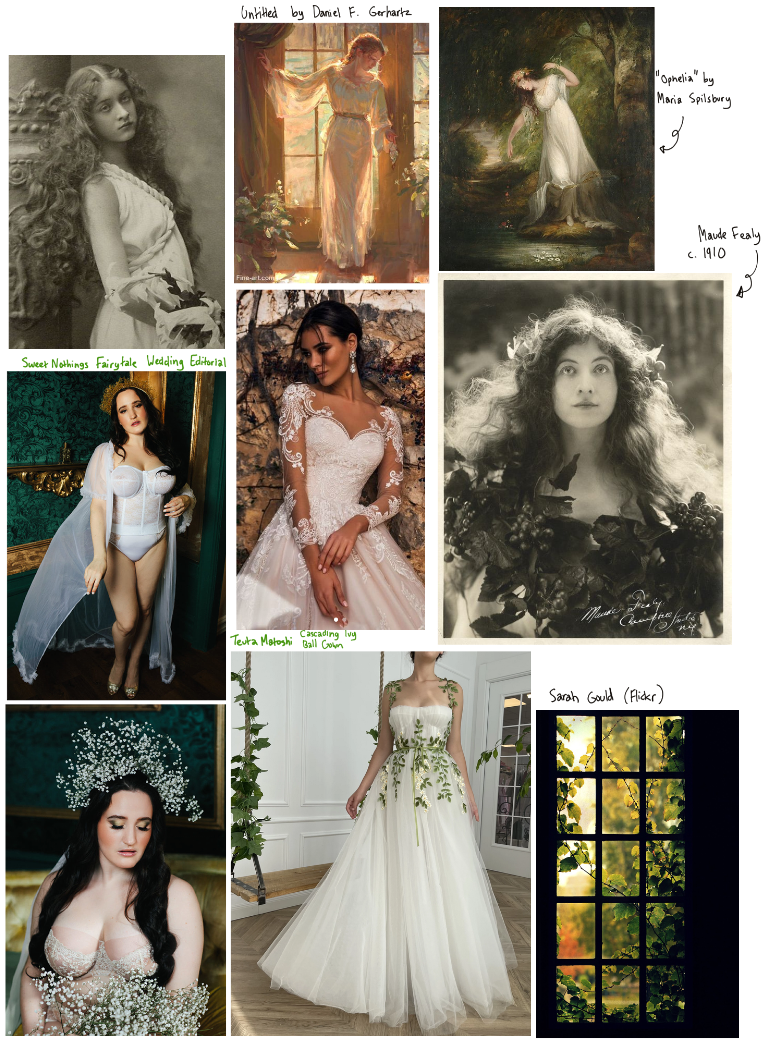
i took a bit of inspiration from a lingerie editorial, actually, The Fairytale Bride by Sweet Nothings. love the colors and vibes in those photos, with the rich greens and golds complimented by airy white fabric and dainty flowers. plus some paintings that i saved because i liked the color schemes/lighting/composition. i loved this photo i came across, in particular, with the vibrant ivy against the windowpane - that gave me a lot of ideas for what i'd do with the background.
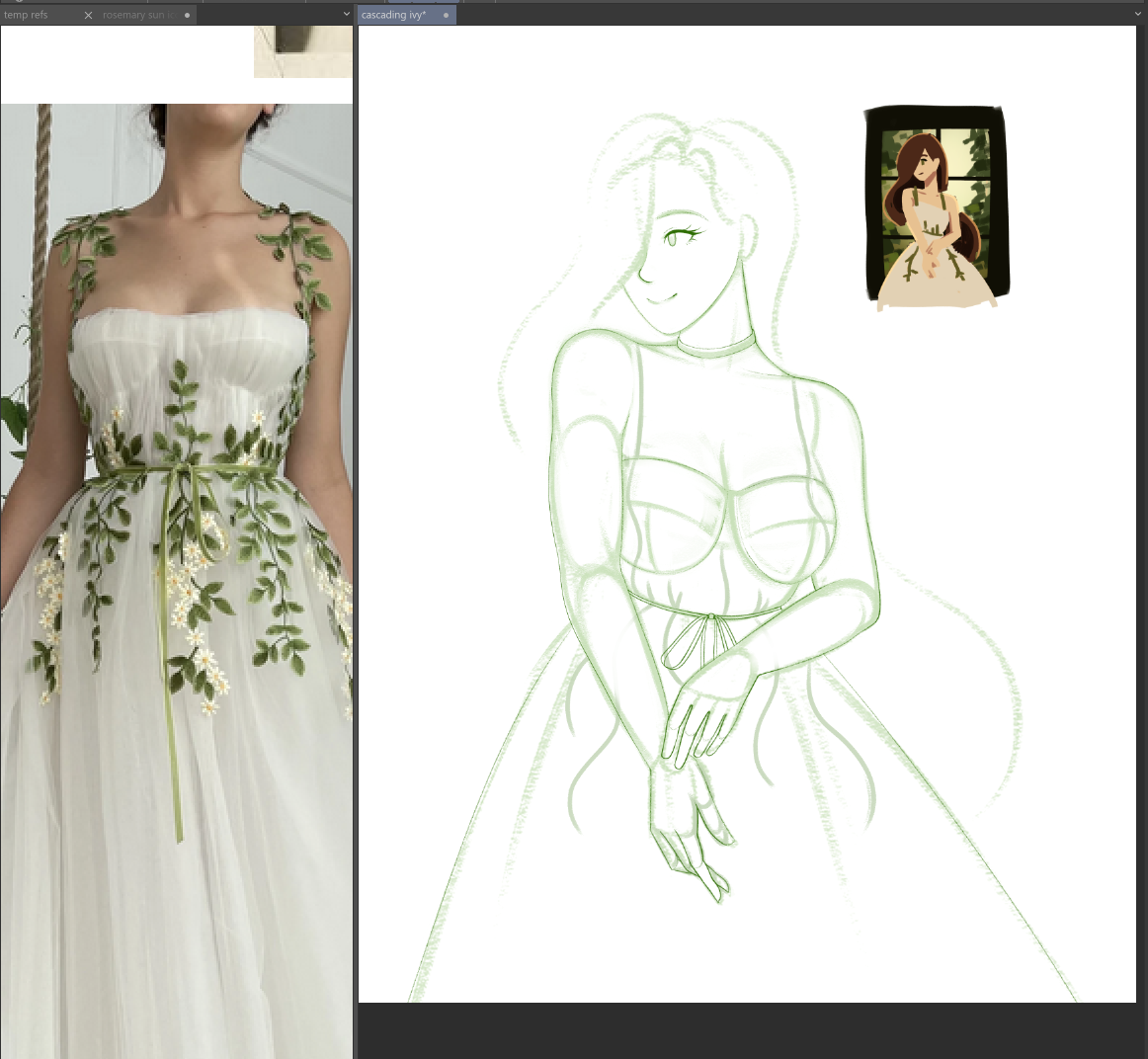
i was able to picture something a lot clearer now, did some quick thumbnails to test, and got to drawing. i simplified the windowpane down to 6 squares, since i thought smaller tiles would be more distracting for the composition.
i'm pretty sure i just zoned out for a while watching Chess stream kingdom hearts 1, drawing leaves over and over. people always think i'm insane for enjoying detail work, but i just find it meditative...
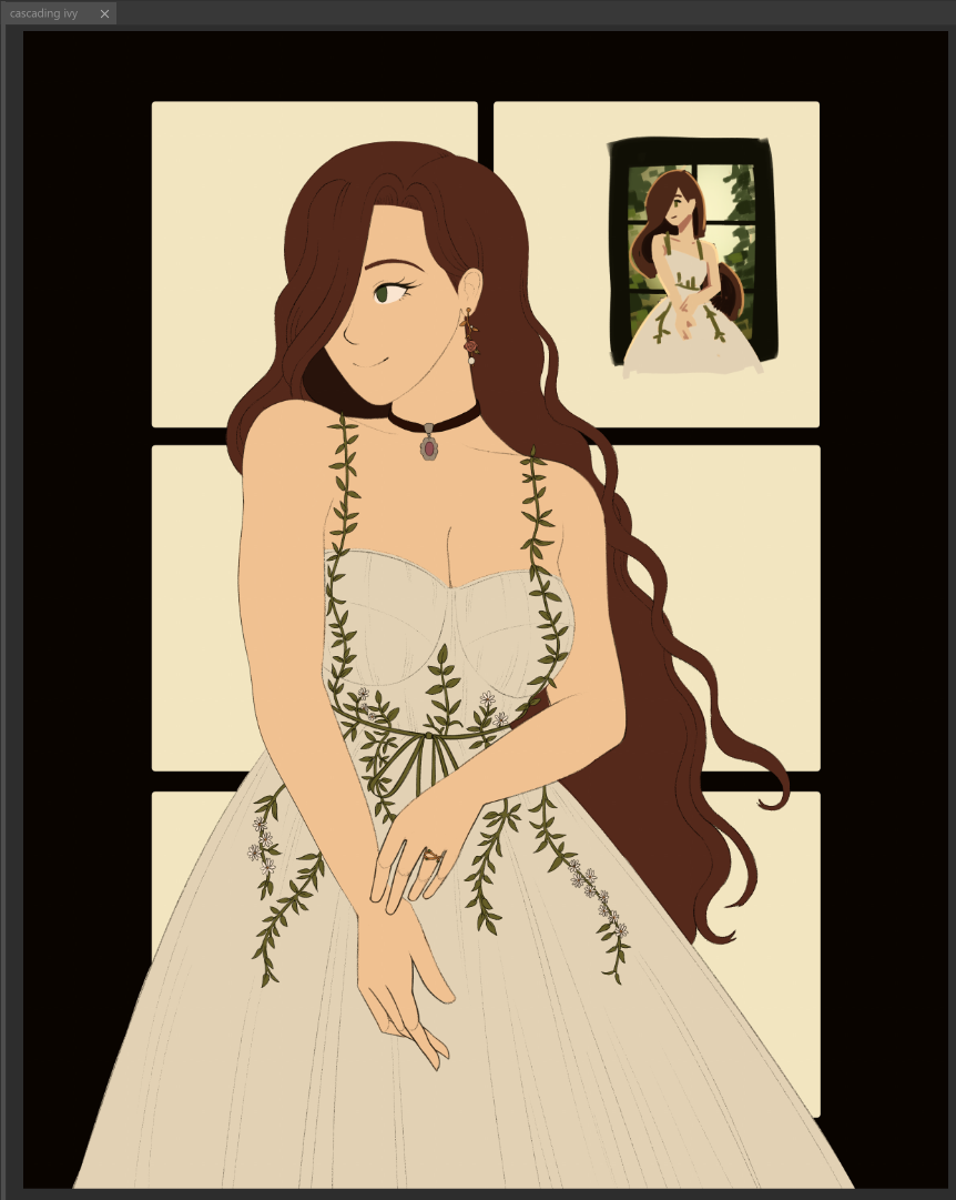
putting down flat colors... it was at this point that i was procrastinating on the background. urgh, i really wanted that ivy to look nice, but every time i tried, it just looked like a 13 year old's failed watercolor experiment. (not speaking from personal experience or anything.)
eventually i did just put down some rough colors, because i had to get some sense of the environment to keep going...
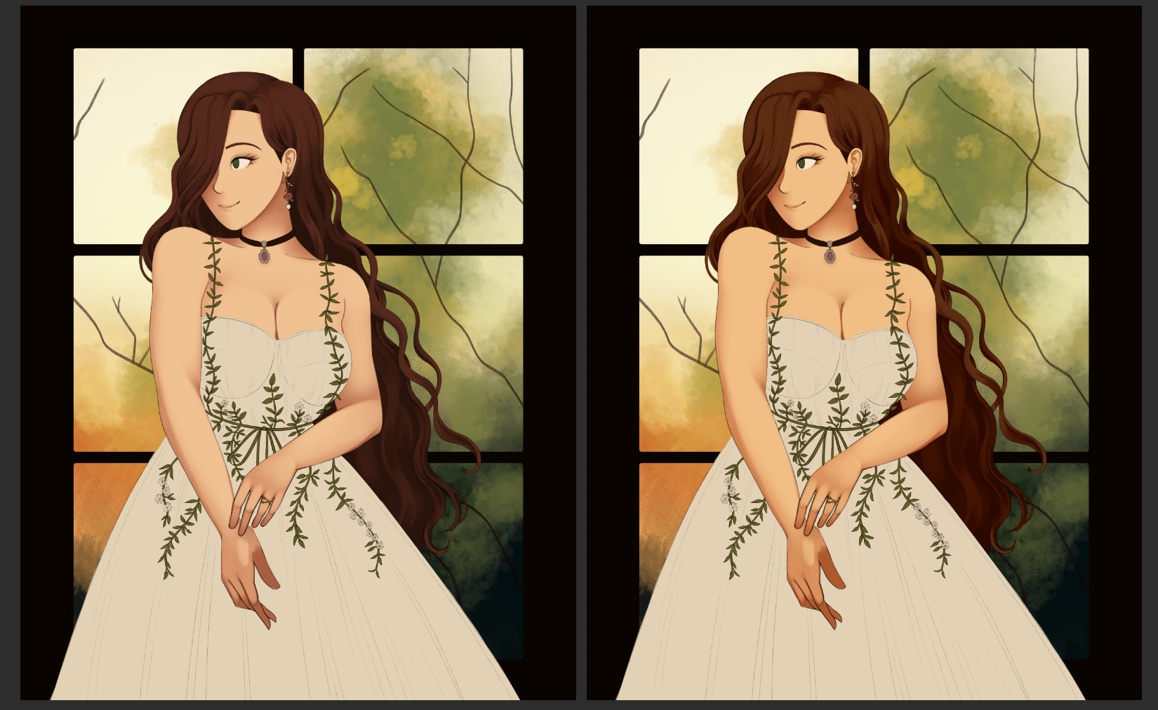
ended up playing with some adjustment layers to make rosemary a little warmer-toned, to match the golden hour vibes of the background.
i also decided to not draw the ivy leaves in the background after all, and keep it to more of a "soft focus" kind of effect. i touched it up a little, to make the blobs in the background more tree-shaped, but other than that, i think that might've been the right call to make. i worried that if i went with really defined leaf shapes, it'd be too distracting from the details on the dress. so... sometimes you just need to narrow your scope a bit, and keep things a little simpler. i promise this is absolutely not just because i was getting anxious about finishing this. (it was both.)
something else i did in the end, as a little trick - i felt like the lines were missing something as i was painting, like they felt a little flat and sitting on top of everything, instead of meshing with the rest of the drawing.
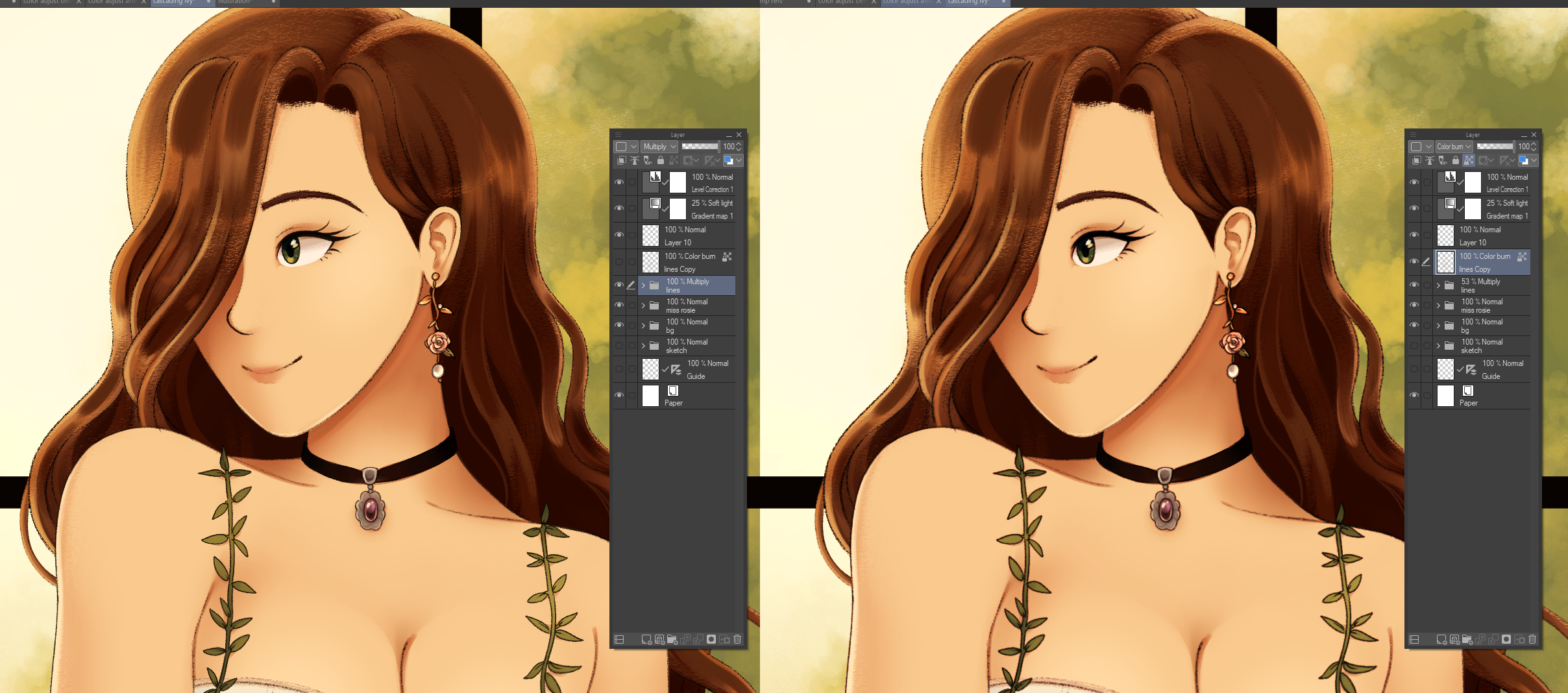
it's a subtle difference - truthfully, i don't know how much you can tell from this screenshot, even. maybe if you pay attention to how different her earrings look? the left image is just the lines set to "multiply", but i still felt like some extra depth and warmth was necessary. so i copied all the lines, merged them together as a separate layer, ran it through one blur filter, and fiddled with the layer blending mode until something looked interesting. i ended up on "color burn", which gave it the edges of my lines a really interesting warmth. the slight blur softens it ever so slightly, without losing detail.
tricks like that are one of the things i really enjoy about digital art, haha. i really like fiddling with layer adjustments and blending modes until things feel just right, i think it's a lot of fun!